Call of Duty mobile: Case study
UX/UI In gaming advanced course case study

About the project
This was an exercise going through the process of designing the UX and UI of a game as part of ELVTR's UX/UI in gaming course, as a way to apply the knowledge and skills imparted throughout the course. I took the course as a way to recalibrate and refresh my knowledge about the ux/ui, and as a way to properly contextualize the knowledge i've gained through my career.
Responsibilities
⦿ Provide a D1 retention assessment and analysis document of the game Call of Duty Mobile (older build) within a learning context.
⦿ Perform a UX/UI retention and engagement strategy analysis and evaluation of the first 16 minutes of gameplay
⦿ Provide proposals to increase the retention issues in the game, based on concrete documentation
Challenges
⦿ Learn and apply the concepts and knowledge acquired during the course.
⦿ Expand my vision of UX away from a specific feature into the project as a whole.
⦿ Generate a project-wide proposal that can better align with business goals.
Project length
2 weeks total work
Tools
⦿ Figma⦿ Illustrator⦿ Photoshop
Initial evaluation
Experience goals
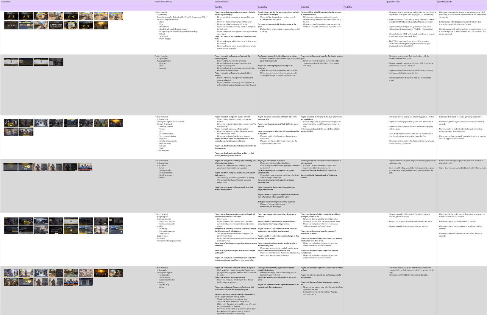
Based on a thorough evaluation of the goals for each feature found within the gameplay established before, i decided to focus on the following goals for the overall experience:
⦿ Reduce information overload by adjusting information hierarchy in order to improve pacing.
⦿ Improve clarity of key features in order to better contextualize players about their decisions in-game
Retention evaluation
By setting up a retention framework, we are able to better identify our player, their purpose, and motivations for progression.
⦿ This allows us to better set the goals for the experience and features composing it.

Engagement evaluation
By evaluating how the different player resources are engaged during this gameplay period, we can further establish the context of the retention issues we need to tackle
Money
⦿ While the game presents the player with the monetization features, it doesn’t linger or force players to engage with it.
Social
⦿ Social modes seem to be de-emphasized early, there isn’t a push for players to engage with the social features of the game at this point.
Time
⦿ This initial period spends a lot of time hand-holding the player through the basics of the game, which might generate friction for players who just want to play.

Reducing information overload
In order to address information overload issues, i first did a full analysis of the learning experience for the section
⦿ The main goal in this case was to find portions of the game on which the feedback isn't clear, instant, or rewarding for players

⦿ based on my findings i decided to focus on the Aim Settings Tutorial and Loadout Tutorial as my main focus
Aim settings tutorial


Issues
⦿ Routine itself isn't very efficient, and contrasts with the other more frequent and efficient habits in this section, like shooting, or moving
⦿ Adjusting your aiming mode at this point might not feel as rewarding for players unaware with FPS controls in mobile
⦿ Section doesn't feel as rewarding or clear as the rest of the components in this tutorial section
Proposed solution
⦿ Move this section of the tutorial to the end, so that it doesn't interrupt the flow of the tutorial
⦿ Make the section optional for players who are comfortable with the controls already, saving time in the process.
Feature goals
⦿ Section is long enough to convey all necessary information, but simple enough to end before players disengage from it.
⦿ Players are able to complete this section ~20 seconds faster if they do not want to change their controls.
Loadout tutorial

Issues
⦿ Tutorial presents information that the player does not have access to at the moment (Tactical/Lethal equipment, perks, soldier and operator skill, extra loadouts)
⦿ Section feels less instant or rewarding for players, as they are shown options that they can’t interact with
⦿ It also feels less efficient, since the information distracts from the main goals of the feature at this point, understanding how to adjust their loadouts (They can only change their weapon at this point).
Proposed solution
⦿ We can improve how instant or rewarding the learning experience feels by spacing out the information, and focusing only on what is immediately useful for the user (Weapons).
⦿ The rest of the elements can be presented as they become available further down the line, with the repetition working towards improving the assimilation of the main habit.
Feature goals
⦿ Players are able to create their own loadout with the available loadout components.
⦿ The process of adjusting the loadout during this section from access to loadout to exit to main screen can be done in less than 10 seconds.
Improving clarity
Once i've adressed information overload, i went back to my learning experience analysis, and focused on sections that weren't clear enough due to not having enough breathing room
⦿ For this i decided to focus on the scorestreak tutorial, as well as the map selection and scorestreak loadout
Scorestreak Tutorial

Issues
⦿ The section clearly shows how to use scorestreaks, but not how to earn them, which hurts feedback clarity.
⦿ As such the game isn’t presenting the entire routine to the players, and misrepresenting the cue, affecting how the player perceives the habit.
Proposed solution
⦿ Instead of giving the player a scorestreak to use at the start of the section, make them rack up the scorestreak themselves by engaging with dummy enemies in a controlled environment.
⦿ This can also work as a repetition for all the features they learned throughout the tutorial, helping reinforce the learning of the presented habits.
⦿ This space can also work as a break from the tutorial, giving players enough time to engage with the game on their own terms before resuming the process.
Feature goals
⦿ Players are able to fully understand the routine of Scorestreaks (how to earn them, how to use them)
⦿ Scorestreak usage is increased compared to the current % during the first match.
Map Selection / Scorestreak Loadout
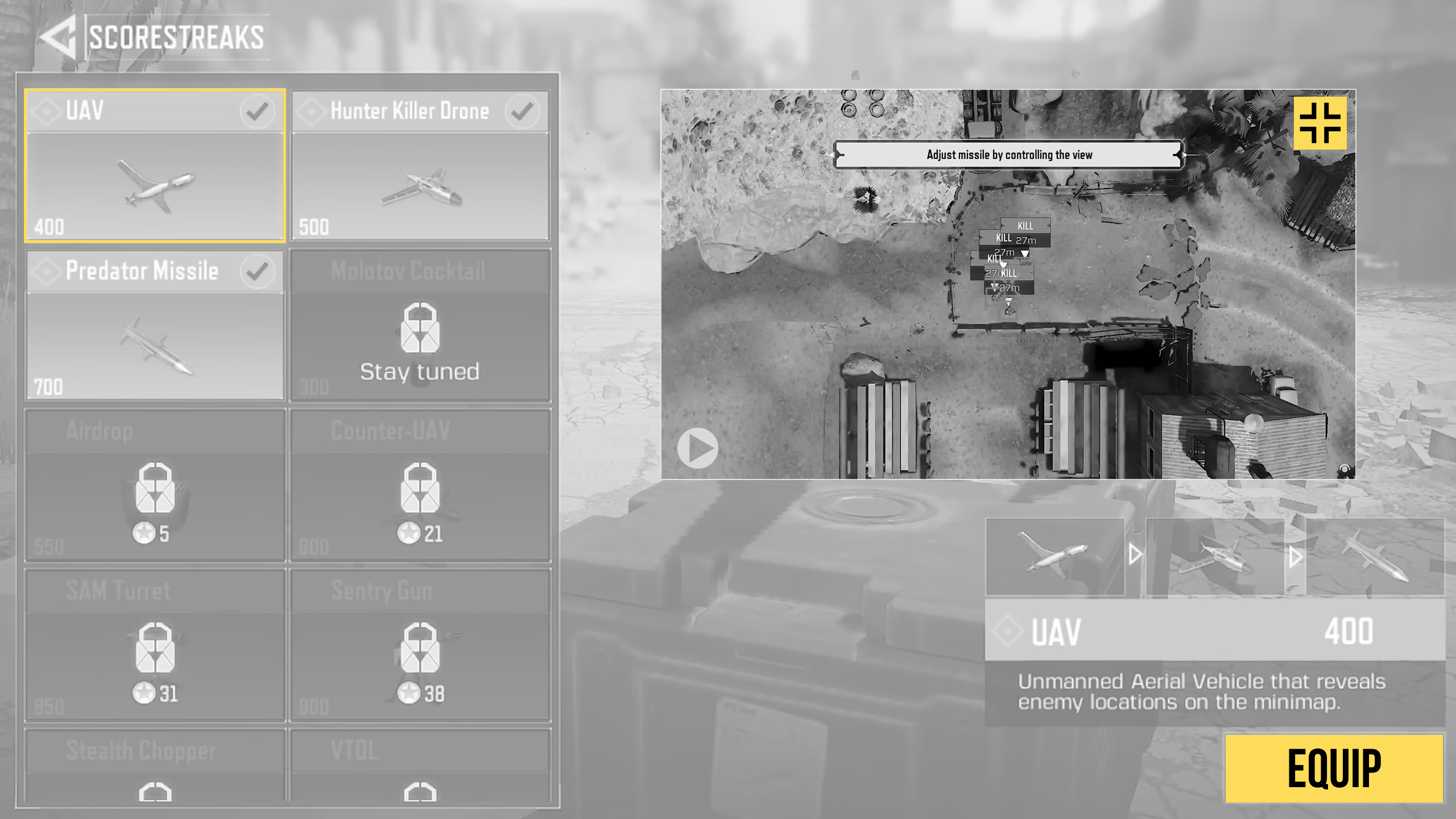
Issues
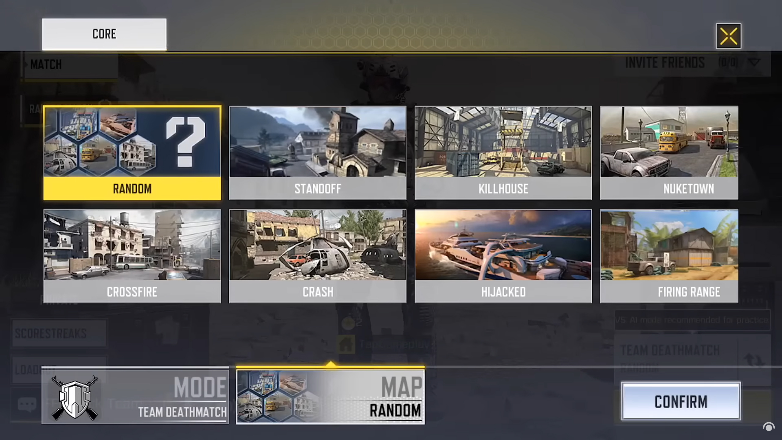
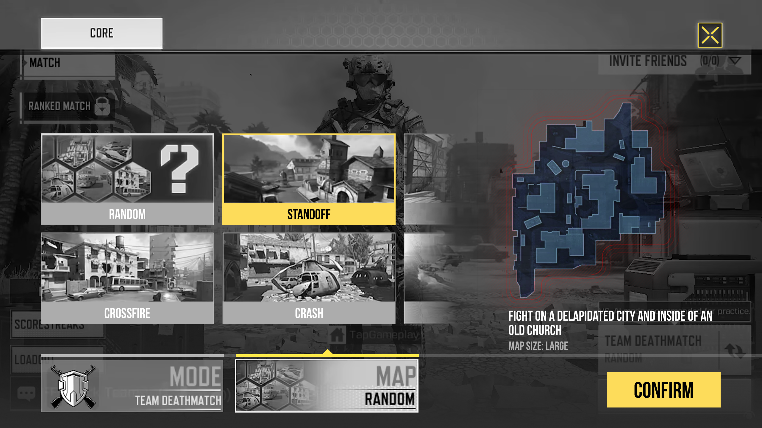
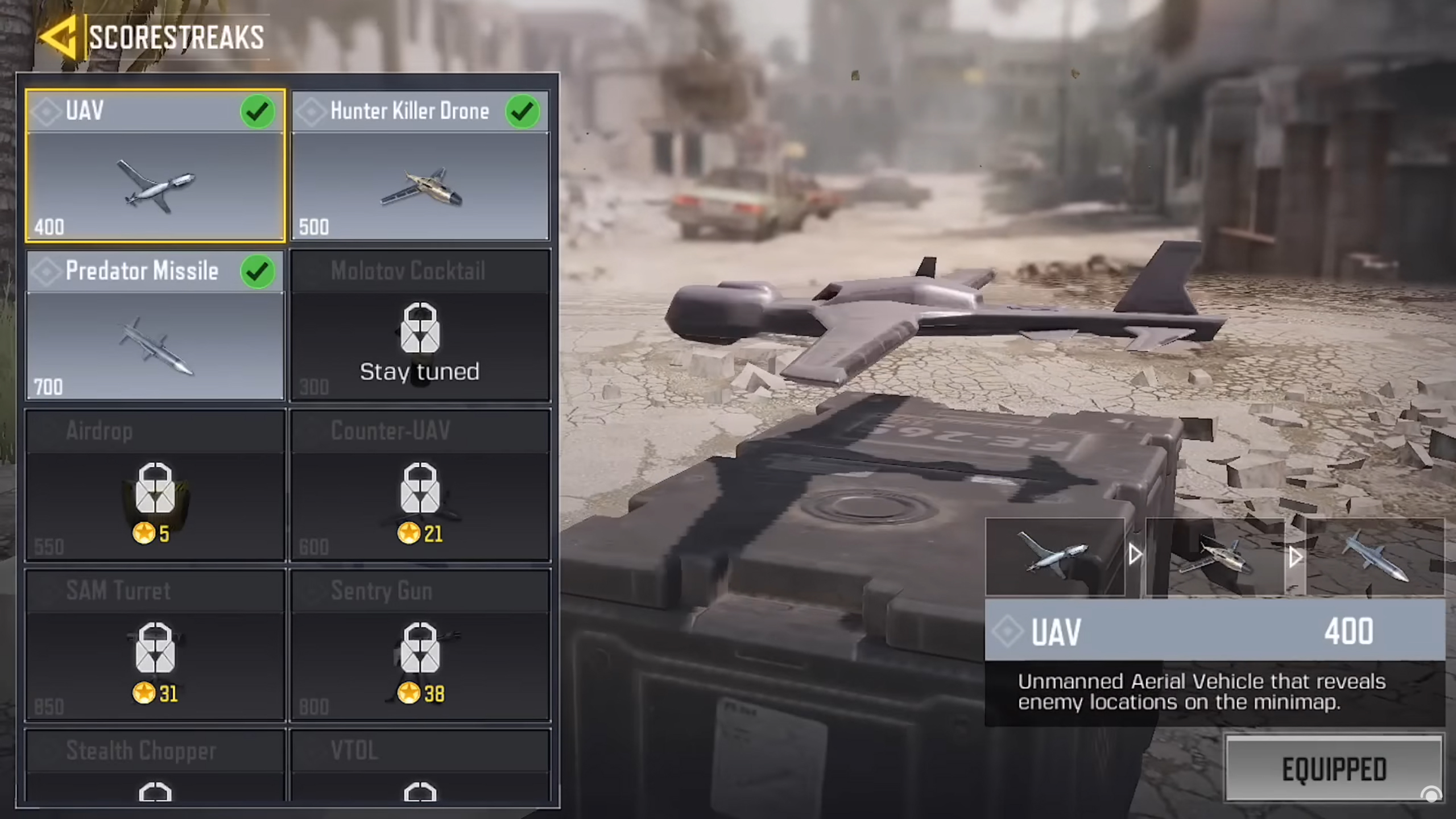
⦿ Some screens can benefit from presenting the information regarding their feature in a clearer way.
⦿ Since players lack enough information to make a decision, the process feels less rewarding that it should.
Proposed solution
Map screen
⦿ Rearrange the map to include more detailed information about it.
⦿ Information such as the abstraction used for the minimap, alongside general information such as size and a general description can be enough for players to get a more clear picture about the maps themselves.
Scorestreak Loadout
⦿ Include more detailed examples of use and effect of scorestreaks, such as video examples.
Feature goals
Map screen
⦿ Players have enough information to get a general idea of how their game experience will go on a particular match before entering one.
⦿ The frequency of the habit of picking a map instead of random is higher than the current %.
Scorestreak Loadout
⦿ Players express more excitement over scorestreaks when going over them in the loadout screen.
⦿ The effective score earned from each scorestreak during the initial stages of the game is increased over the current average.
Outcomes
⦿ With this changes we aim to reduce the retention dropoff that occurs during the onboarding process by making the flow more easily digestible for new players.
⦿ The changes aim to reduce day 1 friction by improving the clarity and feeling of reward that comes from engaging with the game and it's habits.
⦿ This process helped me understand and put in practice UX with a more holistic approach, instead of just focusing on a singular screen or feature.