Portfolio
Thomas Heim // UX UI Designer
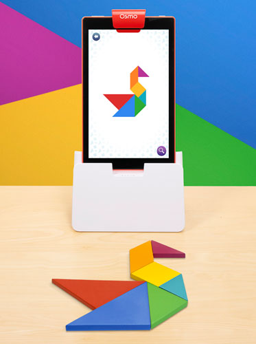
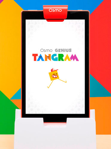
Tangram redesign
For this project our team was tasked with redesigning the current product into a more appealing version for children, in my case this meant taking the new flows that were proposed and updating the UI accordingly to the new experience we wanted to deliver to the kids. As this was my first project at Osmo, there was a lot of learning involved, from how they managed their design pipeline, as well as understanding the experience osmo products want to deliver as a whole.

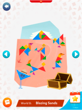
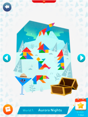
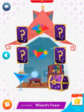
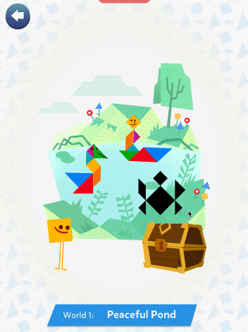
Main hub screen design. The design was made to be as simple as posible given the age of the target audience, also adapting it's color palette to the vaious different worlds, in order to create a more armonious composition.
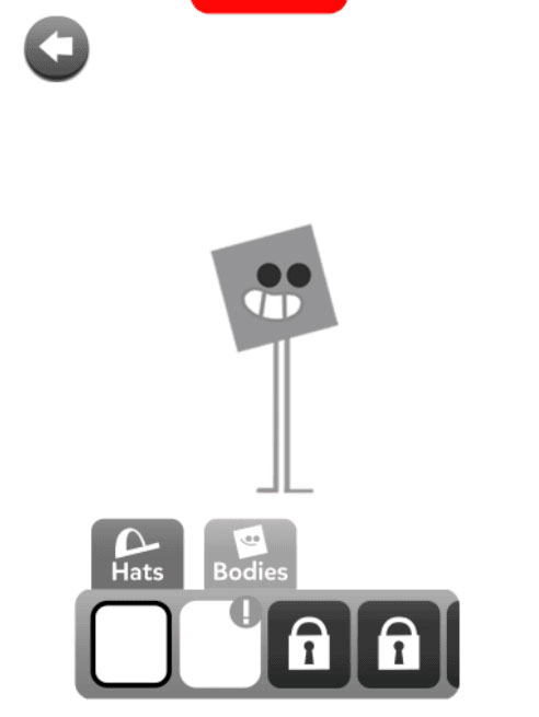
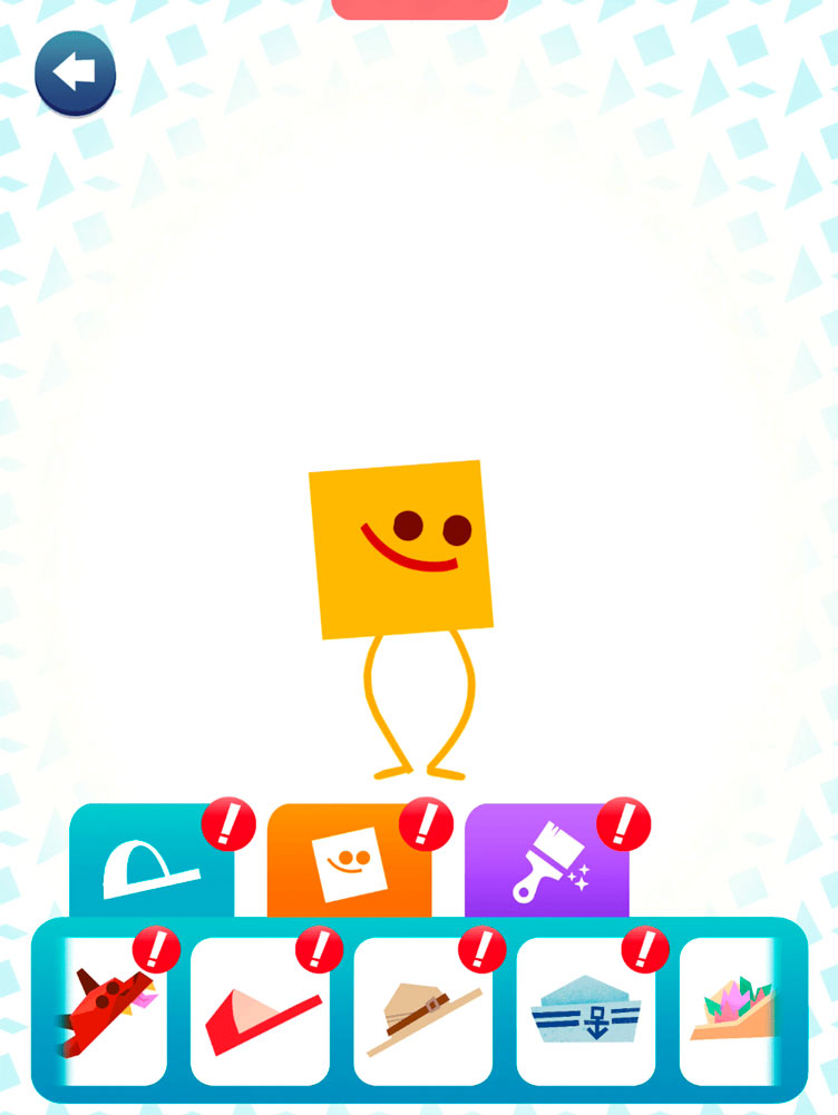
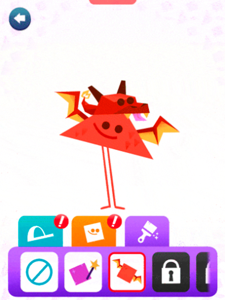
Customization screen design. As with the case before, the main focus was to keep it simple and easy to navigate, while using the energy and animations of the main character in order to create a more fun and engaging experience.
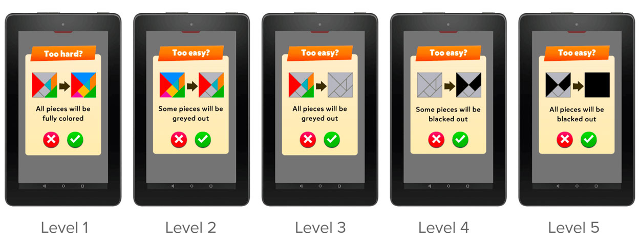

One of the more interesting aspects of the game was the introduction of an "adaptive difficulty" system, that let the game match it's difficulty to the kids ability, creating a smoother experience for kids that weren't really sure of the correct difficulty level for them


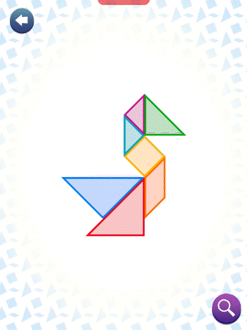
In this case, the focus on the UI was on colorful and easy to recognize shapes, favoring rounder shapes in order to contrast with the more angular shapes of the characters and the tangrams.
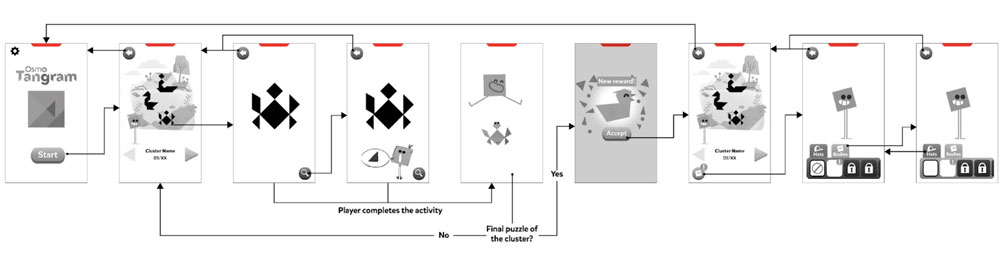
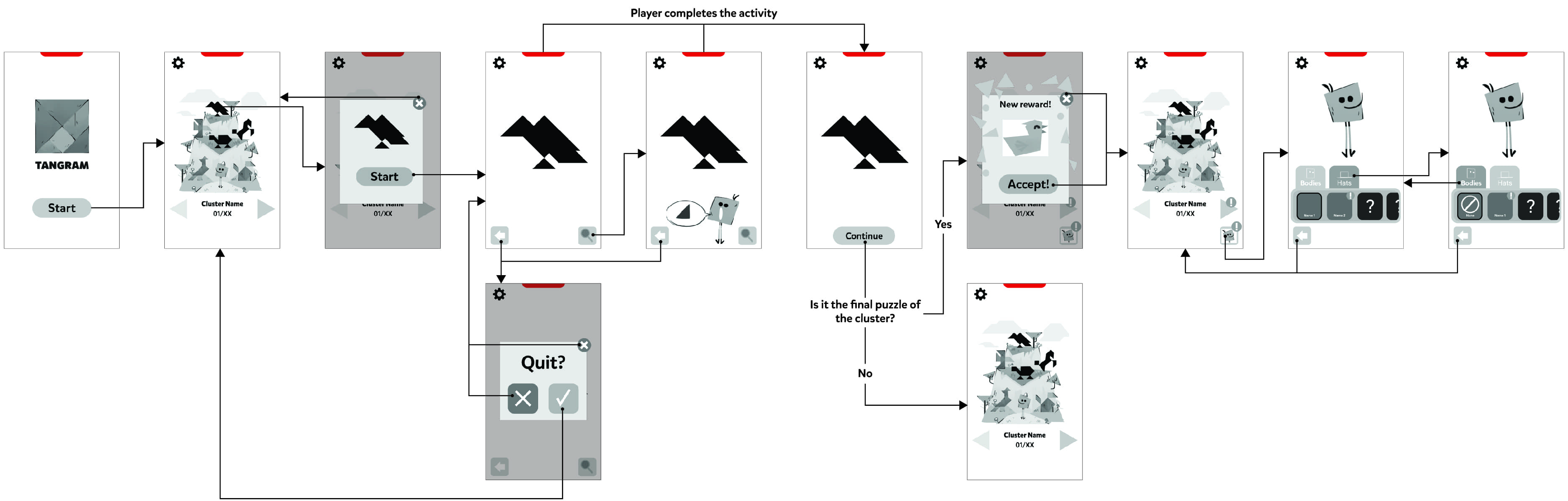
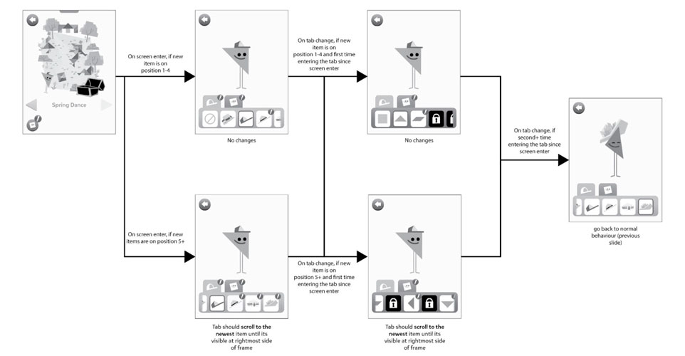
Some of the flow charts created for the different scenarios in the game, much of the design was to make it very easy to understand while minimizing the use of text for kids that can't read.